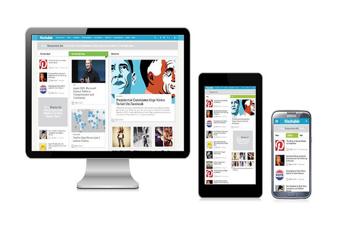
Many of us scour the Internet to find latest news and information on Technology; some of us end up looking on the well-known site, Mashable. Today they have launched a brand new redesign to their website and it looks a lot cleaner and more social.
Clearly they have turned to being more readable for its readers with going with the color white, and showcasing their social shares at the top left, but we want to know what you think. Does Mashable’s new redesign create a happy face or a frowny face when looking at it?


it’s damn ugly!