At SXSW Interactive, there has been a lot of discussion about data visualizations. The industry has exploded in the last 2 years and is quickly becoming both a preferred way of distributing large chunks of data as well as the bane of content creators everywhere. Is it possible to distinguish between true visualizations and invalid ones? Can true creativity, beauty, and usefulness be rewarded while spam is vilified?
Yes and yes.
The good side of infographics
The advantage that visualizations have over spreadsheets and articles is that they can present a message in a way that is more easily and enjoyably understood. Data is inherently boring to most if not put into digestible chunks and infographics allow for that to happen.
Visually-stunning infographics are sharable. Through social media, it's preferable to share information in a way that suits the quick-impact-mentality that permeates across the internet. A well-conceived, properly-designed, data-driven infographic with accurate information can expose important information more quickly than a long article and have therefore become a preferred method for sharing.
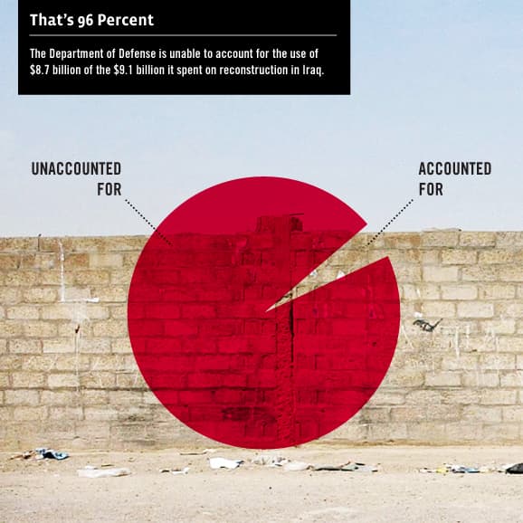
Here's a message that went viral on social media and helped to expose a single piece of data with more impact than had it simply been stated.

The bad side of infographics
There are two major complaints that are circulating about infographics. First, the infusion of poorly-designed and/or inaccurate infographics have called their validity into question. Second, they are often associated with search engine optimization techniques linking to spammy domains.
The first complaint is easily addressed. Those who have websites or otherwise share infographics through social media should be certain that the data they're sharing is accurate. A good infographic will attribute the data with sources normally found at the bottom. Check the sources before sharing. It may be an extra step that can be a pain as they are normally not linked or shortened, but if you're worried about the data, it's best to check.
If the visualization is an eyesore, don't share it. That should go without saying.
As far as the search engine optimization aspect, it comes down to a matter of taste. Infographics are expensive to produce and as a result those who produce them want something back, normally in the form of links to their sites. This is fair as they can be extremely useful and informative when done right. Why not reward the creators and/or those who paid money to have them commissioned?
The "taste" aspect comes when looking at the source. If the source is not a website that you would normally consider sharing, don't share the infographic. It's that simple. The data may be strong and the visuals may be impeccable but if the source domain is too spammy for your tastes, it's better to avoid sharing it altogether rather than get involved with bad domains.
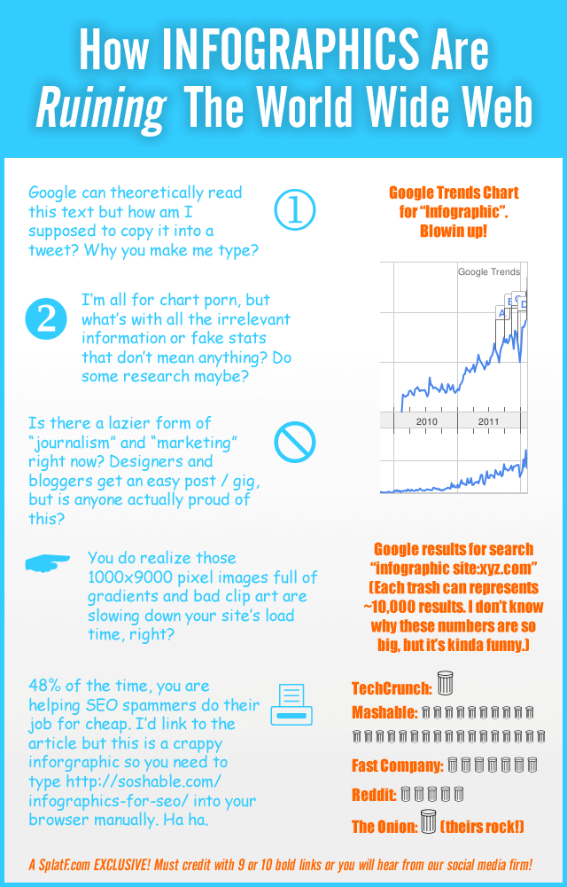
Here's something that can loosely be called an infographic. The message may not be delivered in a "visually stunning manner" but it rings true in a virtual world where the good guys and the bad guys are sharing the same techniques.

Here's a link to the story that the infographic mentions about infographics for SEO.


