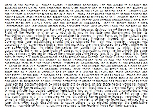
I’m a fan of 6pt type, but this is ridiculous. Computer science professor Ken Perlin has decided to claim the title of designer of the smallest readable screen font. His font, above (duh), is able to compact the first 500 words of the Declaration of Independence into a 320×240 rectangle – perfect for mobile devices.
“My design,” says Perlin, “assumes that screen pixels are horizontal striped as RGBRGB, as are most LCD screens these days.” And frankly, that knowledge alone helps substantially in the legibility of this typeface – which, since Perlin has apparently given it no name, I have decided to call Ittybitty Sans Condensed.
“In contrast, I’ve noticed that Microsoft’s smallest screen fonts are unreadable,” claims Perlin. Frankly, Ken, readability is in the eye of the beholder, and my eye is beholding a hell of a lot of small. Lot of squinting goin’ on, here.
But nevertheless, if you’re an app developer in the business of giving the end user a sweet eyeful of an effing ton of text all at once, you might want to give Ittybitty Sans Condensed a try. If you’re not, confuse your friends! Confound your enemies! Give Ittybitty Sans Condensed a try anyway.


