Stunning. Intuitive. Brilliant. Worthless?
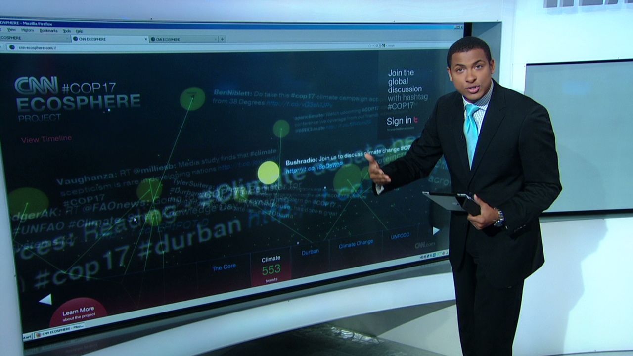
The first three words in the series can clearly be used to describe the CNN #COP17 Ecosphere Project, a real-time visualization of the climate change discuss that led up to the UN Climate Change Conference 2011 being held now in Durban, South Africa. The fourth word in the series is up for debate.
CNN is putting much emphasis on coverage of the conference both through their television presence as well as on the web. They have a show dedicated to the event that ran frequently in November and will continue until the end of the year. The Ecosphere project is highlighted in both venues.
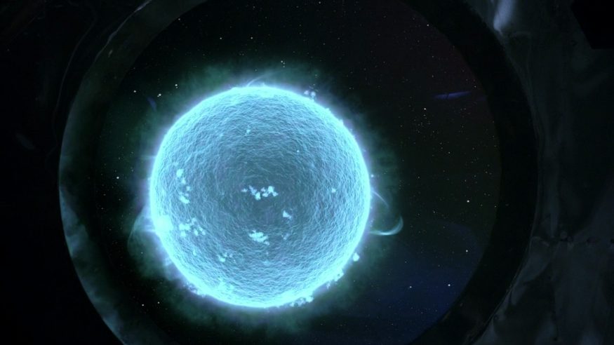
What exactly is it? It’s “a real-time infographic of sorts, treating the viewer to a stunning visual representation of the evolving global discussion. A lush 3D environment that allows the viewer to explore, view content up close or zoom out to observe the visualization as a whole.”
Here’s where it gets mind-boggling in both a good way and a bad way. The visualization “grows” as more Tweets come in with the hashtag #COP17 attached. An algorithm determines based upon keyword analysis which “plant” will grow as a result of the Tweet.
The technology is slick, but the website is so obtuse that you need to have a strong internet connection. Good luck viewing it on an older browser. The latest version of Chrome is recommended. This is a bad thing. In a world that is going mobile with more people surfing the internet on smartphones and tablets, having a resource-hog of a website as the centerpiece for the project was a poor decision. People will take functional over “visually stunning” any day. There should have been a mobile version and/or lite version of the visualization component to allow more widespread exposure to the project.
As a concept it’s strong, but where is the benefit? Delegates will be allowed to sit at terminals at the ECOSPHERE hub where a 3d holographic image will depict the girth of the project. Is that enough? Visualizations can be powerful tools to deliver a message, but in this case there seems to have been too much emphasis placed into form and not enough function.
The interface makes it challenging to drill down to anything other than random Tweets. Coincidentally, the first Tweet I was able to get to on the Conference “plant” was this one:

A better idea based upon the same concept would have been to focus less on the graphics and more on the messages. They could have put less effort in and put together an algorithm that could analyze the Tweets and draw a more in-depth depiction of what the conversations were really about. There are currently 21 “plants”, but some of them are useless. “Canada” has a plant of its own, for instance. Words such as “pollution” and “ozone” do not.
Instead, they could have grouped them together into usable pieces of information and given delegates actionable data. Knowing, for example, that 200 people were discussing water supplies in Ethiopia could have highlighted an actual problem rather than telling us that 955 people Tweeted the hashtag and included the word “Youth” in their Tweet.
It was an admirable effort and could be used as a case study for making a beautiful visualization. It will not, however, do much to help the environment or inspire delegates at the convention.
Here’s a video that details the project:


