

The ebb and flow of design trends always seems to navigate towards and away from simplicity. Today, simple is hot. Flat is hot. Depth, texture, and complex are all out and Facebook is following the trend with their new logo release.
They removed the lower bar that gave it a sheen for a minor 3D effect and are now bleeding the "f" off the bottom edge. It's also a little larger than before. It's clean, plain, and simple. It's very 2013.
The new logo can be downloaded from the site.
Reactions have been positive from around the blogosphere. While beveling and depth are often used to denote a clickable button, the Facebook logo is one that is easily recognizable and that requires no further prompting. If anything, some people need to click on the logo less often than they already do.
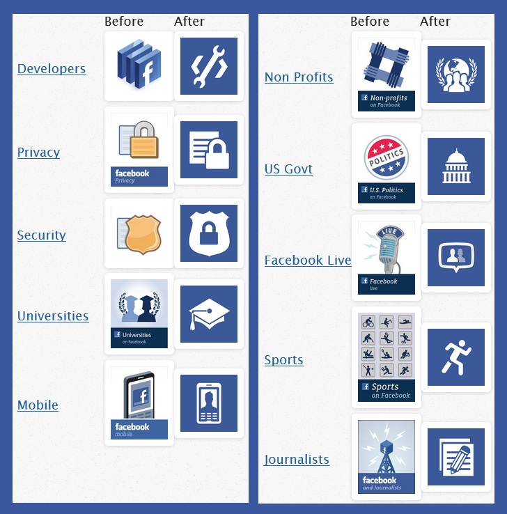
Here are some of the other changes to standard pages on the site followed by the full logo itself:

About the Author

Sal McCloskey is a tech blogger in Los Angeles who (sadly) falls into the stereotype associated with nerds. Yes, he's a Star Trek fan and writes about it on Uberly. His glasses are thick and his allergies are thicker. Despite all that, he's (somehow) married to a beautiful woman and has 4 kids.


