On any other day, I'd tell you I hate infographics. I'm really, really sick of seeing everything turned into a 'clever' set of pie charts. Remember that trend a couple years back where everything was an AfterEffects video where a guy would be talking really fast, and the words would be appearing and zooming around as he was saying them? Yeah, infographics are the new that. Ugh.
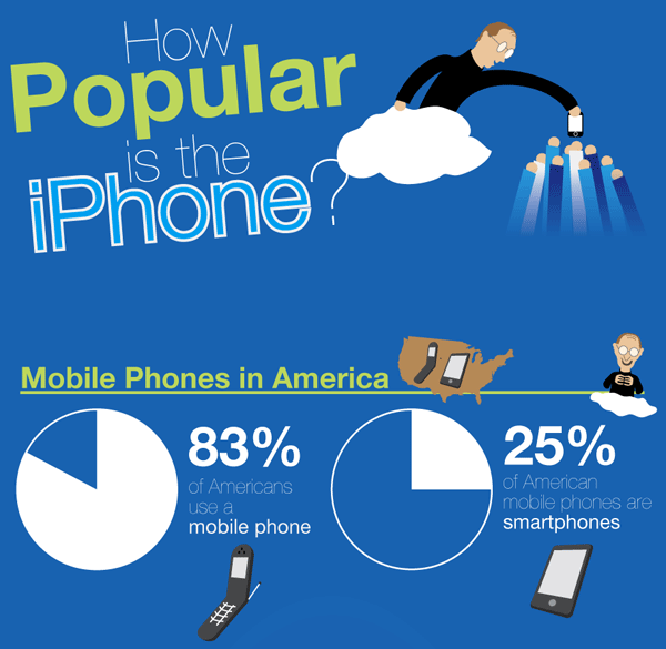
That being said, this is still interesting data to see, and the little cartoon Steves are adorable. Just like the real thing. Courtesy of BillShrink, have a look at the iPhone's popularity, why don't you. Click on the image above to see the full infographic.
And before we get a typical bunch of cries of 'Apple fanboy!' in the comment section down there - I use a Blackberry, guys. Settle down.


