Tag: <span>Browser</span>
Powered by TechAbout11 Stories
Google Chrome Concept Would Kill the URL Bar
As browser wars continue to heat up, Google Chrome finds itself trailing IE9 in one of its most compelling attributes...

Rockmelt Crashes and Burns: Nobody’s Extinguishing The Flames
We were planning on writing about Rockmelt, a new social browser that is the modern-day Flock of Chromium, here on...

Desktop Applications Are On Life Support
It's the year 1936. The first freely programmable computer — the Z1 — is being produced. With the ability to...
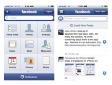
Facebook For iPhone Gets Bumped To 3.1.3
If you have a pulse, you're probably a member of Facebook. If you're on Facebook and own an iPhone you're...
Google No Slouch With Chrome’s Beta Status
Compared to Gmail, Chrome's beta period seems like a blink of an eye. This morning Google's Chrome browser obtained stable...

Firefox 4 Looks To Be The Most Cunning Yet
Mike Beltzner, Director of Firefox, presented a slide show to the Mozilla community, outlining possible new features planned for Firefox...

IE Quickly Becoming Why-E
Microsoft once dominated the world of internet browsing, but yesterday their market share dropped to below 60% for the first...

Surprise: Apple Plays Opera Mini For iPhone (With Video)
https://www.youtube.com/watch?v=r2lPlXHXoVE In a big surprise for iPhone users in search of choice, Apple has approved the third-party Opera Mini app...
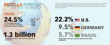
FireFox by the Numbers, Less Secure Than IE?
The folks over at Six Revisions have posted some very interesting materials that reveal the greatness that is Firefox. The...

Browser Battle: Opera Submits Mini Browser For iPhone Approval
There’s an iPhone browser break out beginning, with Opera Software submitting its Opera Mini 5 browser/app for the iPhone to...