If you are not familiar with the name WolframAlpha, it is a website with the main goal to make all knowledge computable.
A website dedicated in providing you the ability to search and find a definitive answer that has been collected using science and various methodization of knowledge to provide one factual source.
Therefore it is not just another search engine but one that will be available to the public to obtain knowledge that spans on professional input, intellectual answers and potentially become known as the “knowledge search”.
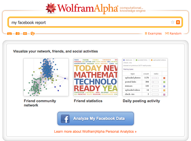
Recently, WolframAlpha has provided Facebook users a way to analyze their Facebook data by typing in the search query “Facebook Report”. Once entered, you are then given a Facebook button to analyze your data, to proceed, you must click the Facebook button (make sure you are already signed into Facebook) and allow the app to have access.
How-To Analyze Your Facebook Data on WolframAlpha

Then a pop-up will appear asking if you want to analyze your Facebook data now, you will want to click this to continue. Your Facebook Data will now load for WolframAlpha to analyze.
What does the WolframAlpha Report Analyze?
Activity
At first glance the data is overwhelming due to the amount of information it has pulled in less than a minute. The report begins with your age, birthday, exact age (right down to the months and days), how many days until your next birthday and your zodiac sign.
If you have shared your location, next you will be able to look at a map of all the places you have been according to what you have inputted into Facebook.
Under the activity section you are able to see your recent history or choose from a drop-down to review your past activities in three different types of graphs.
First graph displays what you have shared to Facebook, separating them into three different colors
- Green = Posted Links
- Purple = Status Updates
- Orange = Uploaded Photos

The second graph breaks down the same information by providing a pie chart displaying your types of posts in percentages. It also gives you the ratio of your shared content, as you can see, links are shared the most on this profile.
The Third graph highlights the times and days of the week you are posting, by clicking the “see details” button you can find out the day you post the most, time you post most often and your most active hour along with the amount of posts during those specific activities.
Post Statistics
The next field will display your Facebook’s profile post statistics enabling you to see the amount of analyzed posts, your total likes (along with average like per post), total comments (along with average comment per post) and the amount of words and characters you input on average when creating a status update.
Below, you are able to view the amount of characters or words that are used the most within a graph.

Check-Ins
If you are connected to Facebook Places you will be able to review your multiple check-ins as well as where and how many times you have checked in, to which is your most checked-in place.
Photos
Under the photo field you will be able to see how many albums you have created on Facebook, how many you have uploaded and the average amount of people that are tagged per photo.
You are also able to see your most “liked” photo, its caption, location, date and names of those tagged within the photo.
Friend Statistics
If you have ever wondered if you are more friends with males or females, you will be able to see the compared gender in percentage on a graph.
You will also be able to see the relationship status of your friends as well as view the breakdown of how many of your friends are classified as married, engaged, in a relationship, single, it’s complicated or other. This data is pulled from what they have entered under their relationship status on Facebook.

You will be able to see where in the world do you friend others the most which will be displayed on a world map and will also list the top countries you have the most friends in.
Learn the top languages, birthdays, most common friends names and who you share the most mutual friends with amongst your friends.
A graph will formulate based upon your friend lists or another format you wish to see from the drop down.
Since there are nearly one million active users on Facebook, we often wonder what we have created from the data we input into Facebook and this information is not easily accessible on Facebook without spending hours or perhaps days trying to collect the desired knowledge about your own Facebook profile.
WolframAlpha will run a report in a matter of seconds that will teach you a little more about yourself from the way you have used Facebook. This information is not currently available for profiles on Facebook nor is the amount of data pulled found anywhere else, therefore you can now easily gain knowledge about your profile by a few clicks and WolframAlpha will do the rest.


