Google is now rolling out subtle changes to their look and feel and site updates to some regions.
Google, well known for their simple homepage and only minor, occasional revisions have been experimenting with slight changes to their logo and the layout of their search pages.
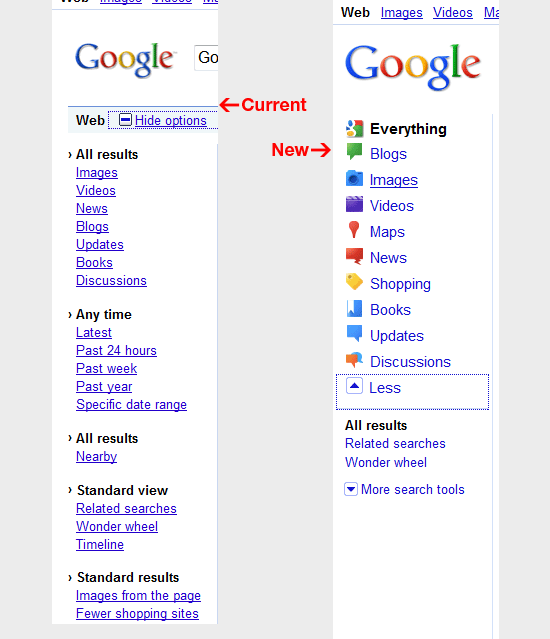
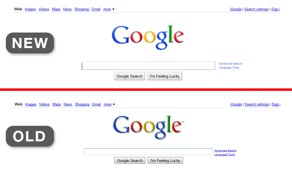
The new logo uses brighter colours with a less emphasized bevel and drop shadow. Changes to search pages include more consistent hyperlink appearances, a cleaner, leaner sidebar, with icons to assist users looking to refine searches.
Google is well known for its overly logical approach to design. Douglas Bowman, now at Twitter, famously left Google after it resorted to user testing to decide the best shade of blue to use for borders for an interface.
Will these changes increase usability, or improve user's chances of finding the data they're searching for? No doubt Google will test to find out, but I for one hope that Google eventually invests in design with serious consideration for better usability.
Source: Six Revisions
About the Author

Toby is a Mac nerd, a hardware nerd and a web nerd, rolled into one.