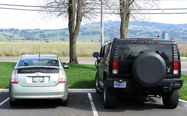
Most infographics are designed to convey a message in a visually stunning fashion that allows the viewer to digest large amounts of information through the fastest method of transfer available: visually. Sometimes, the results can have a different effect. When you view the infographic below from Confused, you'll see that it's intended to give useful tips to those who want to save on gas. It's a worthy effort, visually pleasing, and with enough tips to make it useful. However, there's one other effect that comes from viewing it. Wouldn't it make more sense to get a fuel-efficient vehicle rather than go through the processes described in the infographic. Even the most conscientious gas saver has a hard time increasing their mileage by 4 MPGs. If I worked at a car dealership that sold high MPG vehicles, I'd have this puppy hanging in every office. Again, it's not a bad infographic, but it goes to show that sometimes there are other effects that can come from visualizations.
Published
Here's an infographic unintentionally designed to sell fuel efficient vehicles

Spotted an error?Report a correction →
About the Author

JD RuckerScore 50
Policy and Tech
JD Rucker is Editor at Soshable, a Social Media Marketing Blog. He is a Christian, a husband, a father, and founder of both Judeo Christian Church and Dealer Authority. He drinks a lot of coffee, usually in the form of a 5-shot espresso over ice.


