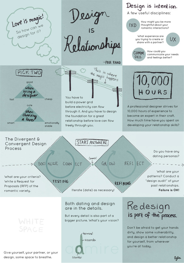
#Infographic: How design and love come together

If you start a sentence off with “Love is like…” you don’t often end it with “…being a designer”. Then again, if you’re not a designer, you probably won’t be able to make sense of any of this anyway.


This infographic by Ayla Newhouse is odd to say the least, but it actually makes some pretty decent points. One this that is interesting is that the design of the graphic itself is pretty fresh just like starting a new relationship with someone.

Disclosure: Some of the links in this article are affiliate links and we may earn a small commission if you make a purchase, which helps us to keep delivering quality content to you. Here is our disclosure policy.

Scarlett Madison
Scarlett Madison
Scarlett Madison is a mom and a friend. She blogs for a living at Social News Watch but really prefers to read more than write.

LEAVE A REPLY

Please enter your comment!
Please enter your name here

Popular This Week
Similar Stories
Fate has not been kind to TikTok in US lately, with tantrums of a legal battle between political turns and...
“You are fired!” seems to be apparently the new in-flight announcement. As Commercial aviation is the art of balancing both...
Artificial intelligence has evolved rapidly along with xAI certainly taking up the challenge with the launch of Grok 3 AI...