Brian Molidor Brian Molidor is Editor at Social News Watch. Find him on Twitter, Facebook, and Pinterest.

#Infographic: The evolution of the iPhone

17 sec read

iPhone Evolution Infographic

It’s hard to believe that it’s been over 6 years since the launch of the iPhone. This groundbreaking phone has changed life as we know it. If you think that this is an overstatement, take a look at what people are doing on subways, in line at the grocery store, at the office, in the bathroom… the list goes on and on.

iPhone Evolution Infographic

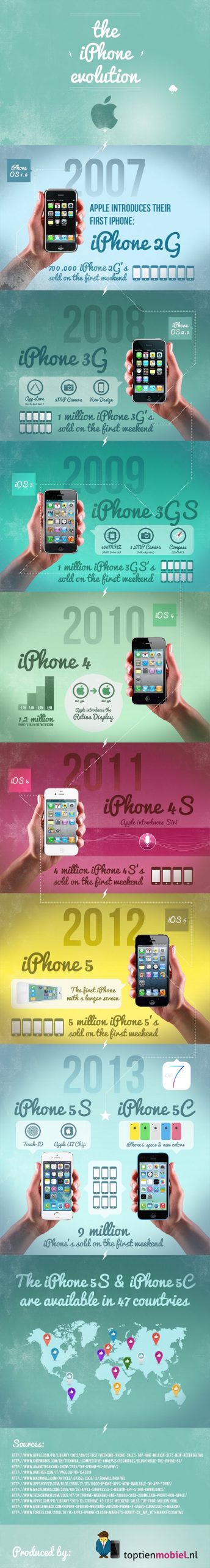
This infographic by Top Tien Mobiel does a nice job at breaking down each iPhone variation in a nice visual package.

Avatar of Brian Molidor
Brian Molidor Brian Molidor is Editor at Social News Watch. Find him on Twitter, Facebook, and Pinterest.

Apple is purging hundreds of thousands of apps from…

It may be the end of summer, but that isn’t stopping Apple from doing a bit of spring cleaning. Tomorrow, coinciding with the launch...
Avatar of Alfie Joshua Alfie Joshua
1 min read

Images of Apple’s first Lightning-based EarPods have been leaked

While we don’t have an official confirmation, numerous reports over the last few months have claimed that Apple will be ditching the 3.5mm audio...
Avatar of Alfie Joshua Alfie Joshua
1 min read

Apple responds to Spotify’s accusations of being anti-competitive

Owning the App Store means that Apple has the power to control the success of apps released on iOS, and owning Apple Music means the...
Avatar of Carl Durrek Carl Durrek
1 min read

8 Replies to “#Infographic: The evolution of the iPhone”

  1. Interesting graphic, but many things are wrong.
    1. The first iPhone was not called the iPhone 2G.

    2. The iPhone 3GS is shown running iOS 5, not iPhone OS 3 (Newsstand, Game Center, the new Voice Memos icon, and the new Music app icon are all present). Also, there was no iOS 3. iPhone OS became iOS with iOS 4, so it should be written as iPhone OS 3.

    3. It appears that iOS 4 is correct (Game Center didn’t appear until iOS 4.1, so you’re good there).

    4. The iOS 5 screenshot is actually one of iOS 4.2 (with the new Voice Memos icon and Game Center, but with the old iPod icon–the iPod icon was removed in iOS 5).

    5. The iPhone 4s that you use isn’t actually a 4s. It is a 4. You can tell by the placement of the antenna notches on the phone (the iPhone 4s had 4, the iPhone 4 had 3).

    6. The iPhone 5 is right, with iOS 6 (hard to get it wrong though seeing as it had a new form factor).

    7. The iPhone 5s and iPhone 5c are correct as well.

  2. Really nice graphic.

    I’d like to point out that even though there’s a pin in the map right in the middle of Argentina, we users have to brought them abroad.

    I think it might be interesting to see what’s the actual distribution of the iPhone availability on the map. I’d bet 90% of the countries are in the Northern hemisphere. :-S

  3. Why does the iPhone 4 slide have the bar chart with 0.2, 0.4, 0.7, and 1.2 on it? If 1.2 is first-weekend sales of the 4, are 0.7, 0.4, and 0.2 million sales for the 3GS, 3G, and iPhone? Because that means the other numbers you have for those are wrong.

    1. That’s because Henry was a big fan of the Nazis, just as all American industrialists were, because they thought someone needed to get a handle on those unruly Europeans.

Leave a Reply

Your email address will not be published. Required fields are marked *