
Coming down the pipe from XKCD is this utterly brilliant map of the state of social networking today. Click the link for the giant one.
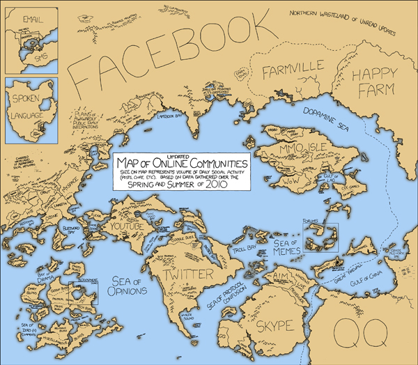
"Communities rise and fall, and total membership numbers are no longer a good measure of a community's current size and health," explains the map. A talking map. "This updated map uses size to represent total social activity in a community - that is, how much talking, playing, sharing, or other socializing happens there."
Honestly, there's nothing to say that the map can't say for itself. "[the map] involved a great deal of guesswork, statistical inference, random sampling, nonrandom sampling, a 20,000-cell spreadsheet, emailing, cajoling, tea-leaf reading, goat sacrifices, and gut instinct (i.e. making things up)"
And how. If your social networking habits were a place, where would you be on this map? You'd probably find me on Twitter Isle, in the mountain range between the Desert of Food Updates, and the village of Shaq.
About the Author

Ty is an illustrator who stays up too late and must wear glasses.