
Yahoo Sells TechCrunch to Investment Firm Regent in Major Media Deal
Announcing one of the jaw-dropping tech deals of the year, Yahoo sold its news website, TechCrunch, to media investment firm Regent. The financial terms...
Tag
24 articles

Announcing one of the jaw-dropping tech deals of the year, Yahoo sold its news website, TechCrunch, to media investment firm Regent. The financial terms...

There are about a dozen sites that I read every day. They're not my 5-day per week reads. I check them out 365-days a year. Techcrunch is one of those...

Anyone who loves the Vine app for Twitter knows two things - it can be a lot of fun and it's a shame it shows up as a link on Facebook rather than a...

Picture this: you’re in the office and want to tell your coworker in the next room that your boss has toilet paper hanging out of his ass. But you...
If you avoided Gmail and stuck with Yahoo mail for the sake of privacy concerns, it's time to find a new provider. Starting Monday, June 3, classic email...



It was probably pretty cool to you the first time you ever tried it on a smartphone or tablet, but the days of being impressed with such things are behind...

Very few people are able to post 3 words on a new website and get articles written about it, hundreds of comments, and RSS feed subscribers before the...

It was big news two weeks ago. Somehow, Michael Arrington's CrunchFund jump and the subsequent drama that has unfolded since has stayed at the top of tech...
According to Bloomberg, AOL and Yahoo are reportedly in talks regarding a possible merger. The report comes just three days after the dismissal of...
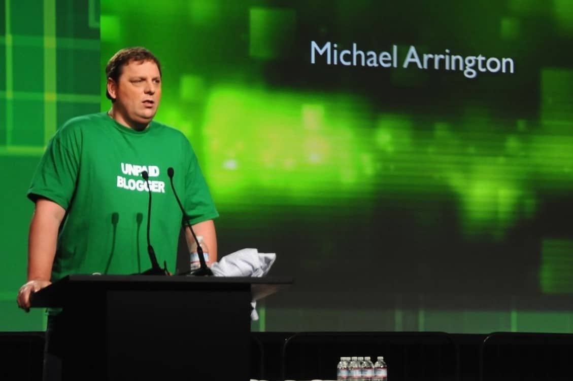
In the past, I have been critical of Michael Arrington, founder and former co-editor of Techcrunch, over several issues. I've questioned his journalistic...

Michael Arrington, the founder of TechCrunch, will be stepping down as managing editor of the popular the technology blog. However, he won’t be straying...
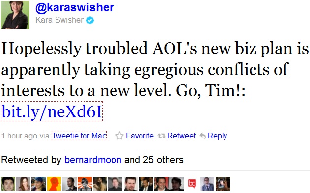
Update: According to Business Insider, Arrington is no longer employed by AOL. This changes the stance of this article a little, but there still remains a...

After downplaying the importance of having an iPad app, images of Facebook’s upcoming iPad app have finally been exposed via TechCrunch. The HTML5-rich...

Michael Arrington and Techcrunch have been called many things by many people over the years. They have a tendency to push towards the controversial side...

Following AOL’s acquisition today of technology news site TechCrunch and video service 5min Media, industry insiders are left to wonder what’s next...

The rumors started flying yesterday. Today it became official. Techcrunch announced that they agreed to be purchased by AOL during their Disrupt...
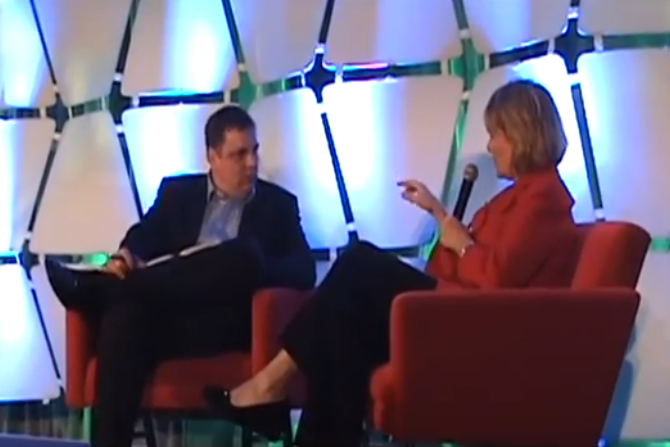
Yahoo's new CEO Carol Bartz was interviewed by infamous blogger Michael Arrington last week at TechCrunch...
A few years ago, when Facebook broke out of its college ghetto into the mainstream, many people welcomed it with open arms. At the time, it seemed like...