Twitter is a polarizing force. Most people, particularly those who are tech-savvy, either love the 140-character-social-networking-microbloggy-thingy or they despise it with an absolute passion. You tweet or you don't tweet. Few are indifferent towards it. As a result of its popularity in both social media and mainstream media, Twitter is often the subject of infographics. Designers love taking the huge amount of data on and about Twitter and transforming that data into something visually stunning. We've combed through literally dozens of infographics about Twitter that have been created over the years and compiled 14 of our favorites. Here are the first 7 - the others will be posted next week. Some are old but still relevant. Others are brand-spanking new.
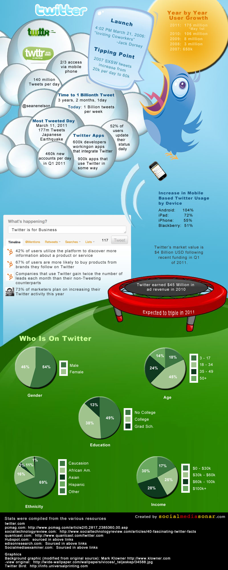
Twitter Infographic
First, we'll start with this piece from SocialMediaSonar simply titled "Twitter Infographic".
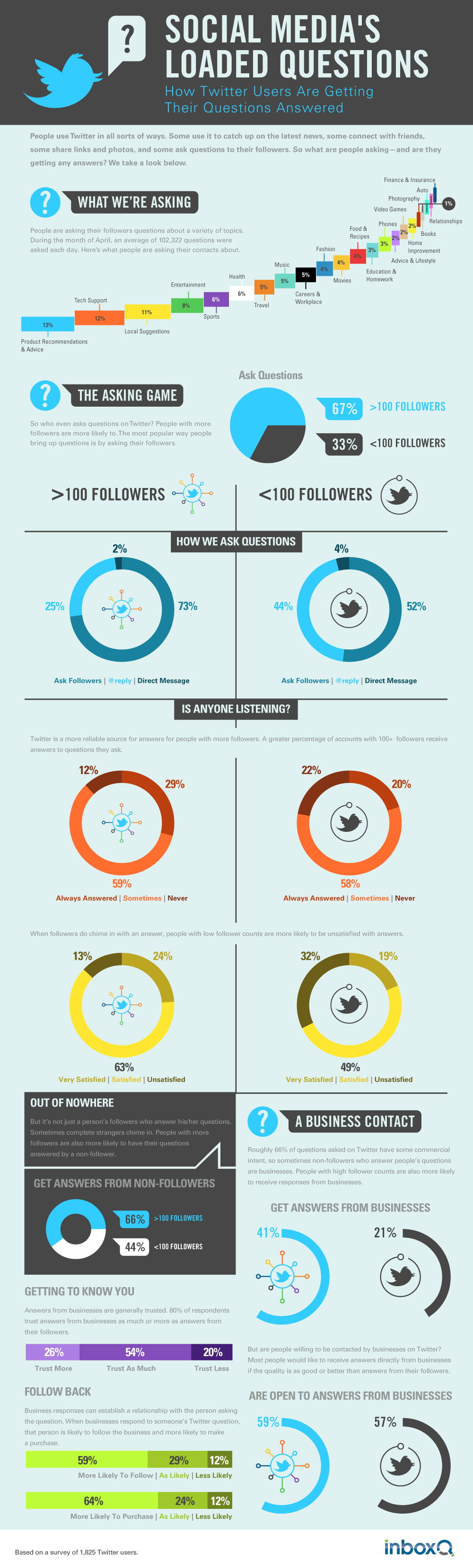
Twitter Questions... Answered?
Anyone who uses Twitter regularly has probably used it to ask a question or two from time to time. It's natural to want to quickly tap into the wisdom of the crowd to find answers about something mundane like "what to have for lunch" to something profound such as "why do we exist?"
This graphic by inboxQ looks at the tendency to use Twitter for these questions, exploring what people are asking and what kind of answers they're getting.
The Current State of Twitter
Even being over a year old, the "current" state as described in this infographic is still stunning.
This graphic by Muhammad Saleem for Mashable takes a long, hard look at the data. Extrapolate out a year and a few months and you can imagine what it's like now.
Twitter Facts and Figures
This, too, is over a year old, and it is still simply amazing to look at the sheer mass of Twitter. Knowing that the site has been growing like a weed since this graphic was designed makes it even more profound.
Website Monitoring Blog put this one together.

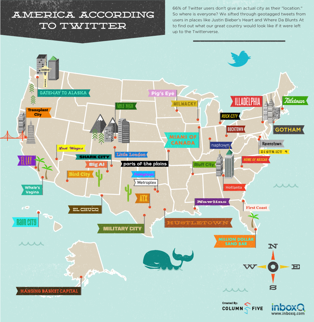
America According to Twitter
Twitter is often used by individuals to express their personality, but it is also used to express the collective personalities of various locations. The way that America looks on a map that is inspired by Twitter location nicknames is both educational and entertaining as our friends at NewsILike know.
This is their second infographic that we found worthy.
<-- Back to "Twitter Facts and Figures" | Continue to "Life Without Twitter" -->
<-- Back to "America According to Twitter" | Continue to "Who, Why, & How of Twitter" -->
Life Without Twitter
This small but entertaining graphic by Hubspot via BitRebels examines 10 things that would change in the world if Twitter ceased to exist (or never existed at all).
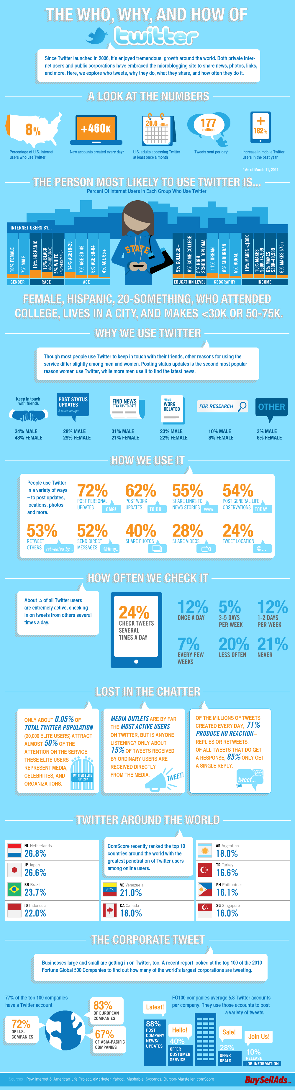
The Who, Why, and How of Twitter
This final one on the list is both timely and interesting. Sometimes we forget just how big Twitter has become in such a short period of time because Facebook has grown so much faster. Still, Twitter has been able to hold its own and is quite arguably the second most important social network out there.
The good folks at Infographic Journal put this piece together to help us round off this list. Part 2, 7 MORE Cool Twitter Infographics, will be posted soon.
About the Author

JD Rucker is Editor at Soshable, a Social Media Marketing Blog. He is a Christian, a husband, a father, and founder of both Judeo Christian Church and Dealer Authority. He drinks a lot of coffee, usually in the form of a 5-shot espresso over ice.