
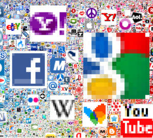
You know those little icons you see in the tab of each website you visit? They're called favicons, from 'Favorite Icon'.
Ever wondered what a million of those would look like? Furthermore, ever wondered what a million favicon icons would look like if sorted and ordered in size based upon popularity?
Me neither. But someone did, and the result is oddly as beautiful, mesmerizing and fascinating as it is useless.
All the usual suspects are there. Google, Yahoo, Facebook, Twitter, etc. There are some surprises though, as it appears as though AOL figures in the top 100, which is weird since, you know, it's not 1998 or anything.
The accompanying article contains some geeky math for those curious about how it was created. The size, for example, is 37,440 pixels wide and tall. Google is the largest icon, not surprisingly, at 11,936 pixels. The smallest are viewed at 16px square, 100%.
About the Author

Toby is a Mac nerd, a hardware nerd and a web nerd, rolled into one.