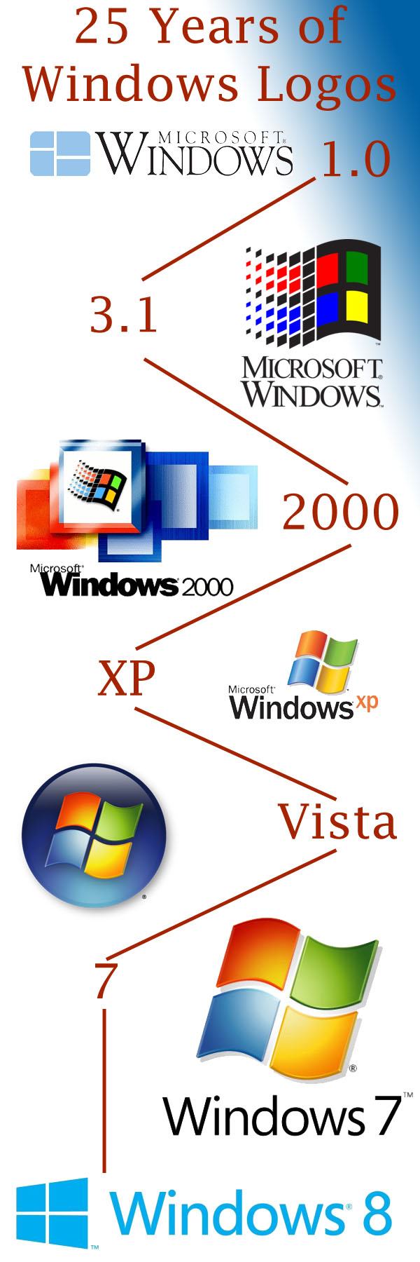
Over the years as Microsoft Windows has evolved since the late 80s, the logo associated with each major release has changed. Initially, it was a very clean, horizontal look. It became progressively more intricate through Windows 2000 before simplifying with XP, then Vista, and finally Windows 7. The Windows 8 logo is possibly the most simple of them all.
In a blog post, they discussed the thinking behind the new logo and they recap each subsequent logo since the beginning. Here are the logos over the last 25 years:
(Via: Insurance Websites)
Spotted an error?Report a correction →
About the Author

@connerlivingstonWriter
Connor Livingston is a tech blogger who will be launching his own site soon, Lythyum. He lives in Oceanside, California, and has never surfed in his life.