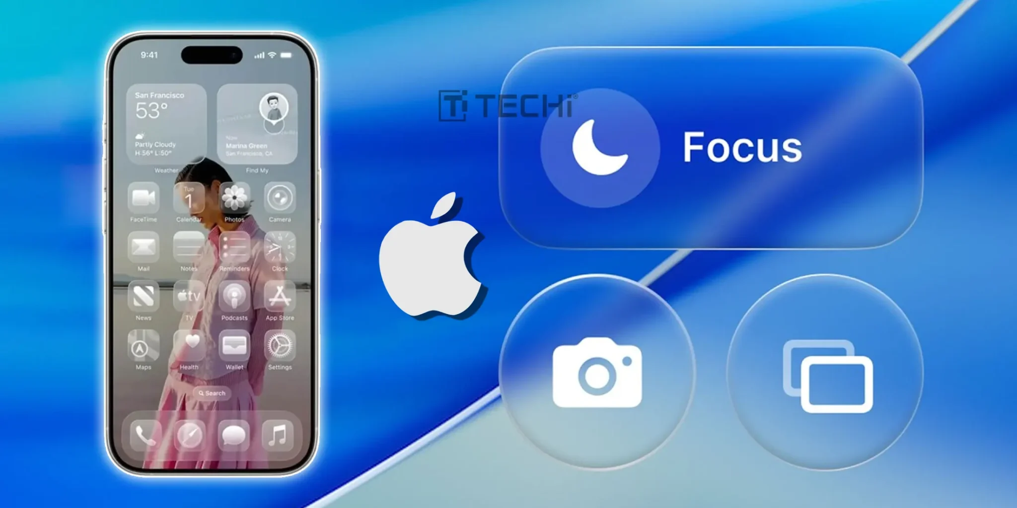
Apple introduced the Liquid Glass design at WWDC on June 9, 2025, unveiling a translucent, glass-like interface across iOS 26, iPadOS 26, macOS Tahoe, watchOS 26, and tvOS 26. This new visual interface basically replaces the flat aesthetic Apple has used since iOS 7, and there was talk all around with its launch that, after UI history’s redesign, Apple’s design team is finally doing something. However, it didn’t last long. Users aren’t delighted and are now posting on social media, calling it the “ugliest thing Apple has done,” and they are comparing it to Windows Vista’s Aero. But honestly, this isn’t new, Apple keeps doing things like this. Remember the Apple Maps launch fiasco? Or how iOS 7’s ultra-flat neon look got toned down in later updates? Even iPhone 14’s Dynamic Island, once a headline feature, slowly faded from centre stage in the 15 and 16 series. But the fact that needs to be highlighted here is that, unlike in the past, Apple isn’t alone in making UI design more practical. This indicates that now they have competition in the market. Other companies like Microsoft, Google and Tesla are also working on bold visual ideas. On the other hand, these kinds of revisions happen often; it probably isn’t that big of a deal. For instance, some experts call Windows 8’s tile-based interface “weak on tablets, terrible for PCs” and criticized the dual UI layers for causing confusion and low information density. Then Microsoft fully replaced Live Tiles in its Windows 11, and it works. Likewise, Google has been iterating Material You to improve readability and usability, and Tesla’s in‑car UI is evolving toward minimalism for better readability. Same as that, Apple has not abandoned the idea; they are working to refine it. The community provided feedback, and they’re tweaking the formula to make sure it works for everyone, not just designers at WWDC. The ups and downs are a part of success. These lags and shifts aren’t failures; they are signals that Apple is listening, adapting, and shaping a design that can actually survive in the market by making users content. Great innovation is not a straight line; it’s a journey full of twists, turns, and corrections. Liquid Glass might have stumbled, but it does not mean that it’s over.